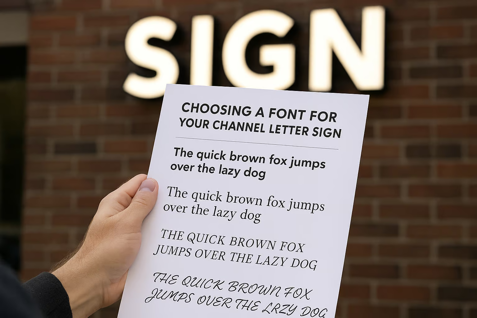
Choosing the right font for your channel letter sign is more important than you might think. The font you select not only affects how your sign looks, but it also impacts readability, brand perception, and even how many people notice your business. With so many fonts out there, it can feel overwhelming, but by understanding the essentials, you can make a choice that truly shines.
Understanding the Role of Fonts in Channel Letter Signs
Fonts do much more than just display your business name—they set the tone for your entire brand. A bold, modern font can signal innovation and energy, while a classic serif font might communicate sophistication and trustworthiness. The right font helps your signage send the right message to your customers before they even walk through the door.
Visibility is another major role that fonts play in channel letter signs. Since these signs are often meant to attract attention from a distance, the font needs to be legible and clear. Fancy or overly intricate fonts might look great on paper, but they can be hard to read when illuminated on a storefront. The goal is to ensure that passersby can quickly and easily read your sign, even from across the street.
Consistency is key when it comes to branding, and your channel letter sign should be no exception. The font you choose should align with your other marketing materials, such as your logo, website, and printed materials. This creates a cohesive brand image that people will remember and recognize, making your business stand out from the competition.
Key Factors to Consider When Picking a Font Style
Readability should always be your top priority. Some fonts may look stylish but can become difficult to read, especially when viewed from a distance or at night. Stick with fonts that have clear, distinct letter shapes and good spacing between characters. Avoid fonts that are too condensed, too thin, or have excessive flourishes.
Another factor to consider is the mood or personality you want your business to convey. For example, a tech startup might go for a clean, minimal sans-serif font, while a bakery could choose a script or rounded font to convey warmth and friendliness. Think about your target audience and what kind of feeling you want your sign to evoke when they see it.
Lastly, size and scale matter. Some fonts look great in large sizes, while others can become distorted or lose their impact. Test your chosen font at the actual size it will be displayed on your channel letter sign. Also, consider how the font will look when illuminated, as some fonts may appear differently when backlit or front-lit. Taking the time to review your options in real-world conditions can help ensure your final choice is both beautiful and functional.
Selecting the perfect font for your channel letter sign doesn’t have to be a daunting task. By understanding the important role fonts play and considering key factors like readability, brand personality, and visibility, you’ll be well on your way to making a smart choice. Remember, your sign is often your business’s first impression—so make it count with a font that truly reflects who you are!


